Establishing the Brand
Since gaining the trust of future or current homeowners is crucial, we figured that the best solution was to create a logo that is credibility-based. This was accomplished by using certain design elements to display trustworthy traits.
In the logomark, the straight and bold lines communicate traits such as professional, stable, and safe. An uppercase typeface was also used to enhance the clean look of the logo, and is just bold enough to display a sense of authority.
The color palette was also intentionally selected to complement the credibility traits. Blue is often used to symbolize calming, protecting, security, authority, and seriousness.
Brand Implementation
-
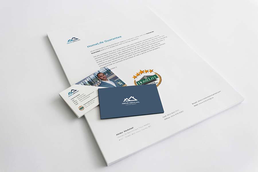
Branding used in business cards and stationery
-
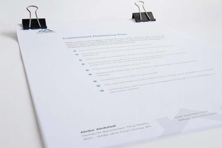
Customizable templates for the stationery used in the realtor's listing package
-
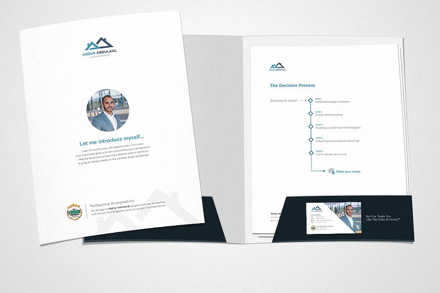
Personalized folder design for the hard-copy version of the listing package.
-
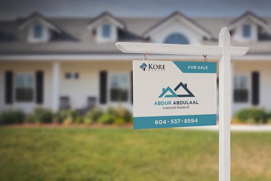
Personalized sign posts that are placed in front of houses that are for sale.
-

Advertising on social media: customizable graphics that showcase homes that were just listed.